
Ciclo Ágil App
UX/UI and Product Designer Volunteer Work
A menstrual control app, to helps people understand their menstrual cycle. My work was UX/UI and Product Designer, I created the app design, design system and the app visual design.
This is a volunteer work for the company Pipoca Ágil, where I used UX Design, UX Research, UI Design and Brand Creation. I work on the UX/UI team.
Goal
Understand people's difficulties in controlling their menstrual cycle and help them by creating a digital product.
Time line
2024 - in progress
Tools
Figma
Miro
JIRA
My impact
We validated the app with the research and based on people's difficulty in controlling and understand their menstrual cycle.
Team
Josiane Cardoso Silva
Melissa Gouvêa
The project
The app is on the Front and Beck End development.
When the app is ready we will launched the app on Google Play Store.
Problem
People have difficulty understanding and controlling their menstrual cycle and predicting their ovulation period.

Research methods
We conducted two surveys, a quantitative one and a qualitative one.
Target Audience
To understand this people
Surveys
Quantitative and Qualitative survey
To understand the user flow and usability, we did:
Benchmarketing
A competitive Analysis
Usability Test
To know what need to
be improved
Analysis
We used the following analysis methods to understand the research results and the users, in the future will do a usability test.
Matrix
Coustumer
Journey Map
Insights
48,85
Don't want to get pregnant
84,1%
Want to monitor mood and symptoms
49,4%
Don't know how to control
when will menstruate
40,2%
Don't know when they are ovulating
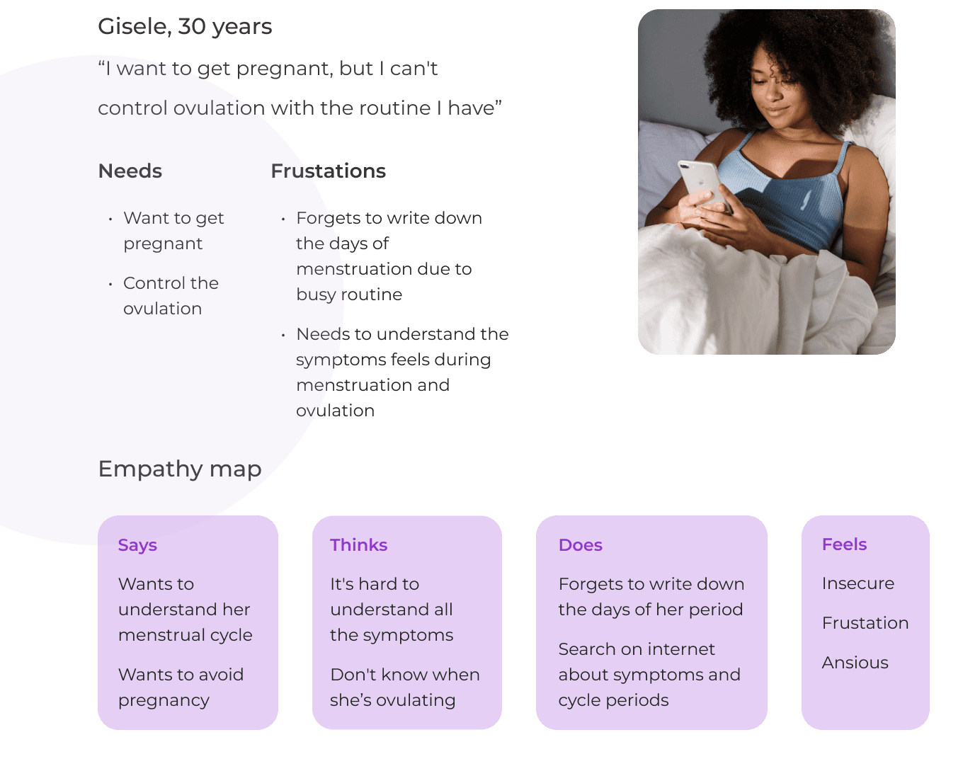
Persona and User Journey
After the analysis, we created the persona.
Hypothesis
How we could help people to control
and understand their menstrual cycle?
Create a menstrual track app
Where people add personal and menstrual information.
Notification
People get notificated about next cycle, ovulation, mood and fisical activities.
PDF information
The app generates a PDF with all informations, so they can show it to their doctors.
Design the solution
User Flow and Information Architecture
We analized the apps in the market, to decided wich funcionalities we wanted on our app.

Low Fidelity Prototype
We applied the notes, free drawing, crazy 8’s and prototype, to help us visualize the app and we validate with Heuristic law’s.
We created the wireframes using Figma and Material's Design 3.

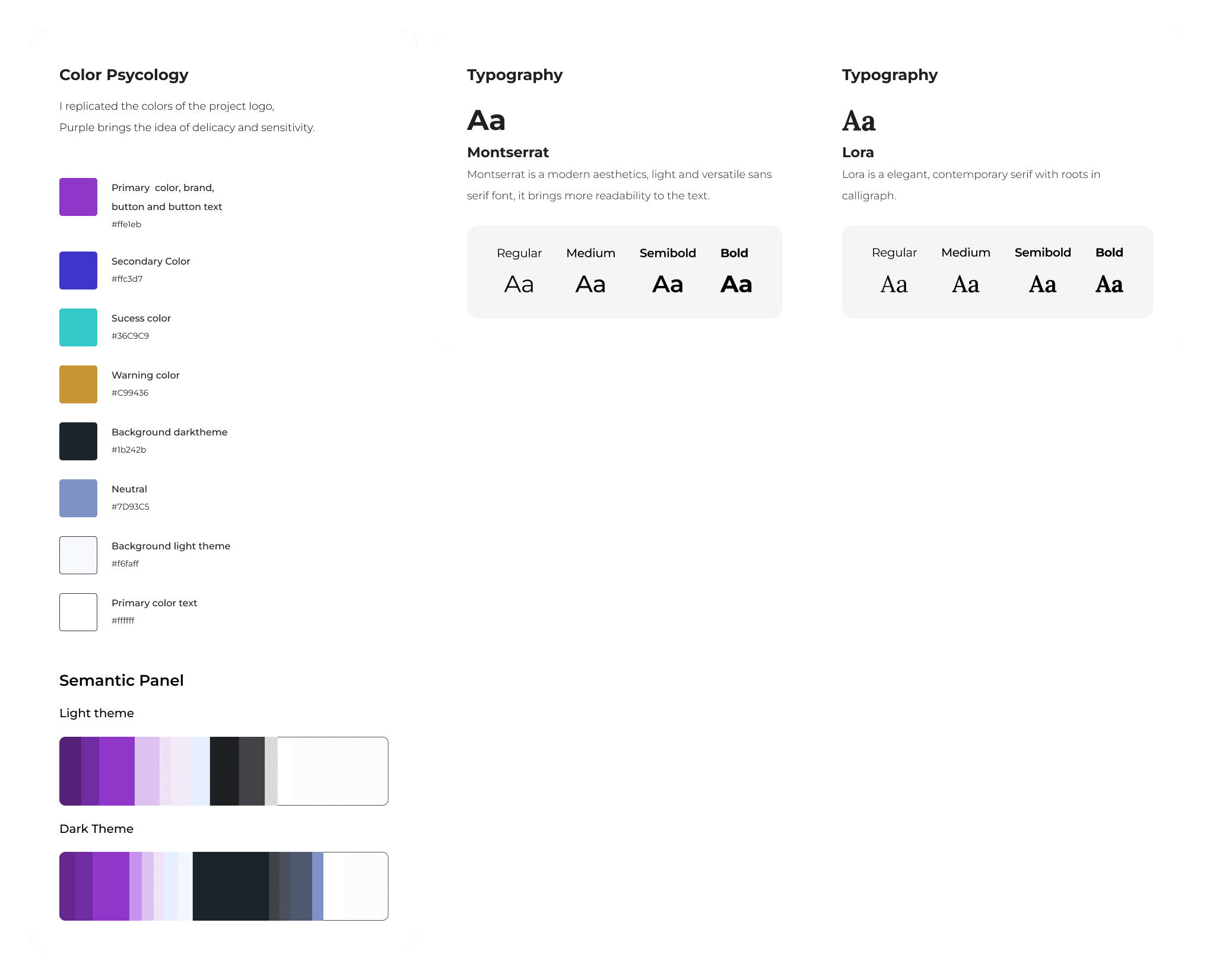
Design System
We used Color Psychology to guide us. We created the brand, visual identity, tone of voice and we use Color Psychology to guide us.

Usability Test
We had to skip testing with wireframes, because we still have some screens to made. The tests will be made by us, the devs and QA's.
High Fidelity Wireframes


Next steps
The next steps are create new screens, usability text and front end and back end development.
Conclusion
Point I learned:
The importance of research: without it I would not have the most important insights into the project.
Working as a team made me expand my knowledge and understanding of the project and people. It also taught me about working collaboratively with people using the Agile methodology.Delegate functions.
This app was created at the company Pipoca Ágil as part of a volunteer work project, where I used UX Design, UX Research, UI Design and Brand Creation. This is a ongoin project. The names of all group members:
Scrum Master: UX/UI:
Carla Panegocci Josiane Silva
Elinalda de Sá Melissa Gouvêa
Product Owner: Front End:
Michele Zacarias Luciano Lima
Jéssica Debortolo Pedro Rondelli
Quality Assurance: Back End:
Aline Pereira Luciano Martins
Thalita Lisboa Rayandson Silva
Karine Bueno
Thank you for coming till here!
© Josiane Cardoso, 2024. All rights reserved.