
Centro Incentivo App
UX/UI and Product Designer Freelancer
An app for professionals working with autistic children, aiming to centralize student information.
As a UX/UI Design, I crafted the app from scratch based on the MVP and guidance from the Prodcut Owner. Adhering to the brand's colors. I develop the design system and visual aesthetic of the app.
The app is a project for a non-governmental organization.
Goal
Understand what tutors needed and create an app that helps them treat autistic children by centralizing data making their work easier.
Time line
1 month - 2024
Tools
Figma
Miro
JIRA
My impact
I validated the app based on the survey, I was able to create an app that met their needs. Today, there is no platform or app aimed at this niche on the market in Brazil. The Incentive Center will be the first.
Team
1 UX/UI Designer
1 Product Owner
1 Front/Back End Developer
The project
The app's MVP is complete, but there are still screens to unveil and usability tests. One friend and I created the app together, she as a PO and I as a UX/UI Designer.
Problem
Tutors don’t have a centralized digital platform for managing data on autistic children. Generally, these professionals use paper and Excell tables that result in disorganization and information loss.

Research methods
I did quick mixed research with professionals at Centro Incentivo.
I explored their system to integrate their Excel data organization seamlessly into the application, aiming for familiarity and usability.
Mixed Survey
Quantitative and Qualitative questions
To understand the user flow and usability, I'll do in the future:
Usability Test
To know what need to
be improved
Analysis
I used the following analysis methods to understand the research results, the users and align the insights from tutors.
Affinity Diagram
Matrix
Coustumer
Journey Map
Insights
Organization
They need organize their data in the same system they have
Color system
They have a color-coded task system to differentiate activities status
Main problem
They can't organized data
and end up
losing information
Easy to use
They want something they can understand and easy to use
Parents can acess
Persona and User Journey
After doing the research with tutors, I created the persona.

Hypothesis
How we could help teachers organized
their data
Create an app that
An app that centralizes data and with the same system they have
Easy to navigate interface
User Centered Design
Parents can have acess
The parents can have acess to see their children progress
Design the solution
User Flow and Information Architecture
First, the PO explained to me what the stakeholders wanted, and then we started to do the user flow. To do this we use Miro.

Low Fidelity Prototype
For the sake of time, I did the sketches and I did the low/medium fidelity wireframe in Figma and I used the Heuristic's and fixed the errors.

Design System
I used Color Psychology to guide me. I used the brand colors and choosed the blue as the primary color, as blue is used as the color os autism.

Usability Test
I haven't done the usability tests yet because we have things to align with the tutors and new screens to be created.
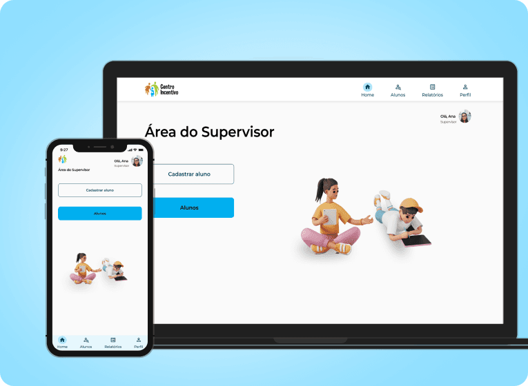
High Fidelity Prototype
The app's MVP is complete, but there are still screens to unveil and usability tests. Today, I share the main screens of this ongoing project.
Next steps
The app is still being developed, there are screens to be created, tests and improvements.
Conclusion
Point I learned:
I learned from this project to work by combining the ideas the client already had and needed in the project and to use usability to be easier and more intuitive and also familiar to teachers, using the same color system they have. I couldn't put all the screens here because the app is still under development.
Thank you for coming till here!
© Josiane Cardoso, 2024. All rights reserved.